


How much color space does the user need?
A very nice question, isn’t it? Finding an answer to this is not easy. But basically doable. But before I answer the question from my point of view, let’s first clarify: What is a color space? Simply put, a color space can be a subset, of the color range visible to humans. As most people know, there are only three basic colors(RED, GREEN and BLUE), if you mix them, you get colors like yellow, brown or white or black. Whereby purely scientifically speaking – black means the absence of light. Here we are again with OLED panels – I hope you understand the context (individually illuminated pixels). With LCD based panels, we remember, you try to minimize the light throughput by means of voltage (current) to get black.
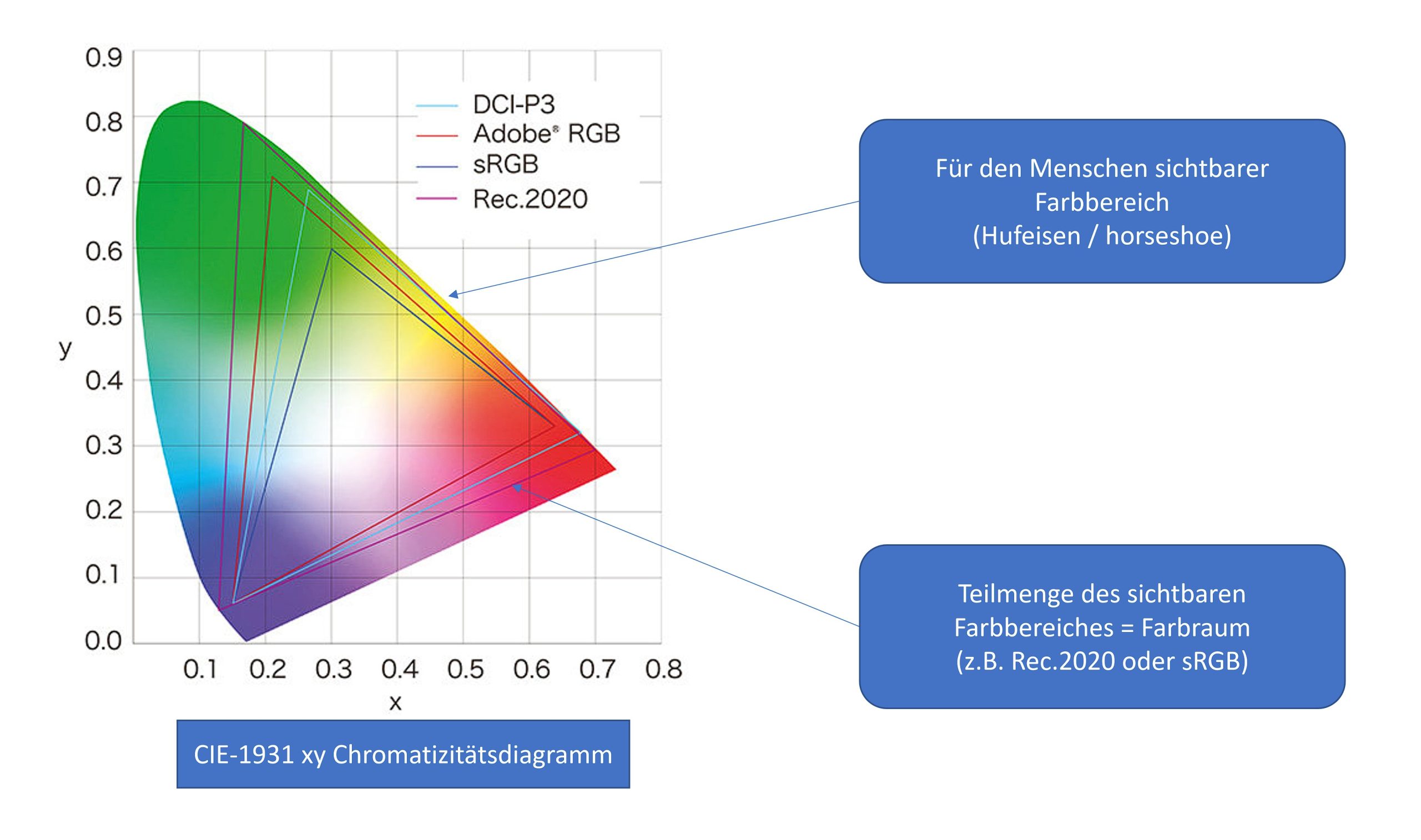
If you want to know what CIE-1931 means: Click here!
Here you can see the entire – for humans visible – color range. Also called “Horseshoe Shape of Visible Colors” quasi the horseshoe of visible colors. And within this horseshoe, more and more color spaces have established themselves internationally over the past decades. Some, for us as users (whether gamers or professional users) quite important – are already shown here. A subset of visible light here would be the sRGB color space, for example. Most people probably know it or have heard of it. What I would like to check off at this point is the color space Rec. 709.
Rec. 709 vs. sRGB – When like ends up unlike
The sRGB (Standard RGB) color space was created in 1996 by HP and Microsoft to set a standard for the use of colors on the Internet. In other words, everything you see online (homepages, YouTube, apps (PowerPoint for example) as well as all games) are provided in the sRGB color space. Means: If the author displays his work in the sRGB color space and the user has this color space 100% available on his display and uses it calibrated, then the image, the video, the app, etc. will look to the end user exactly as it was intended by the author. Cool thing!
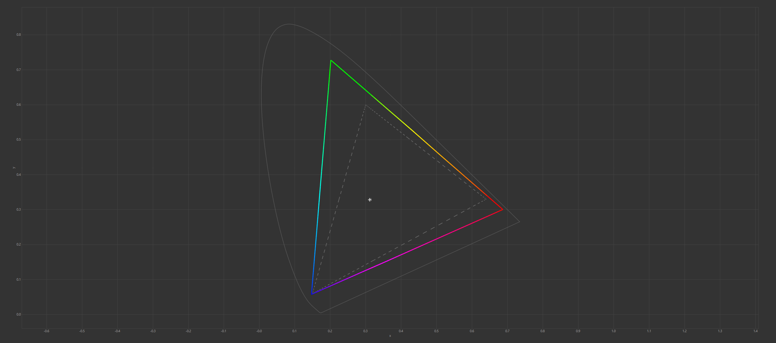
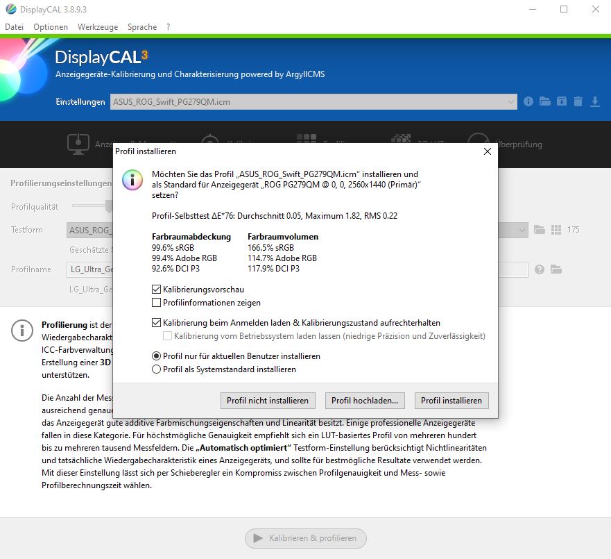
Here is the color space sRGB measured on the ASUS ROG Swift PG279QM. You can see that the dashed triangle (sRGB), is clearly exceeded. (Measured with DisplayCal)
My monitors are calibrated to different color spaces. Thus, I use a wide gamut for gaming. This can lead to color oversaturation. Because the monitor has more color space available for display in wide gamut, so the image, video, etc. looks different than intended. In any case, you should know this. You’ve probably all noticed this, because if you watch the same video on different devices (TV, monitor or cell phone), you’ll end up surprised. When in doubt, these three devices are far from displaying the image the same way.

The color space Rec. 709 where Rec. stands for Recommendation – also known as BT. 709 – comes from the ITU (International Telecommunications Union). Now we are already in the realm of contant creation. Rec. 709 uses the same color space as sRGB with one difference. The gamma curve! While sRGB uses a gamma 2.2, Rec. 709 a gamma of 2.4 (sounds strange – but it is). Rec. 709 is the worldwide standard for HDTV (1920 x 1080 pixels), which has been around since 1993. Let’s leave aside the issue of broadcasting in hertz (e.g., in 50 vs. 60 Hz), etc. (This is a total disaster in my eyes!)
In short, the gamma value can be used to brighten up images that are too dark or too bright. This is usually much easier than playing with brightness and contrast. Anyone can try this out at home: Simply display an image of your choice on the monitor and change the gamma value in the OSD. So, if you have calibrated your monitor to sRGB, you only need to set the gamma value to 2.4 and you can watch an HD movie (Rec. 709) enjoy as it was thought or made. More about the gamma in relation to the monitor will come.
DCI-P3 and Rec. 2020 UHD TV and HDR requirements send their regards
The color space that you often hear about besides sRGB is DCI-P3 from 2005. (DCI = Digital Cinema Initiative) This is a color space that is used in particular in digital film productions. With P3, compared to Rec. 709 more color volume especially in the red to green range. A current minimum requirement for HDR movies is > 90 DCI-P3 color space coverage. If you compare the size of the covered color area in the CIE 1931 diagram, you will end up finding that it is comparable to the size (area) of the Adobe RGB color space. But clearly more shifted into the red zone lies. The DCI-P3 color space is basically only for content creators and less for gamers. If you want to watch movies on the monitor and do so as close as possible to the author’s intention, then a high DCI-P3 color space coverage would be helpful.
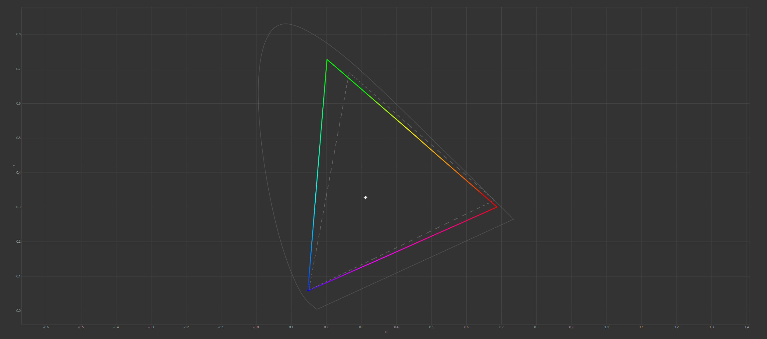
What you see on the picture corresponds to a DCI-P3 color space coverage of 96%. The ASUS ROG Swift PG279QM unfortunately cannot completely cover the outer edge between red and green. However, it is basically sufficient for working in the DCI-P3 / Display P3 color space. When it comes to DCI-P3, you have to be careful about the gamma. DCI-P3 uses gamma curve 2.6 and a white point of 6300 K (D63). While Display P3 (comes from Apple) uses D65 (6500 K as in sRGB and Adobe RGB) and Gamma 2.2 (like sRGB). The D65 white point is now used internationally as a standard: good thing!
There are other P3 specifications, but that would take us too far at this point. If you want to know more about this, you should read up on it. But honestly, P3 is all well and good. Things get really interesting when you look at the extended color space.
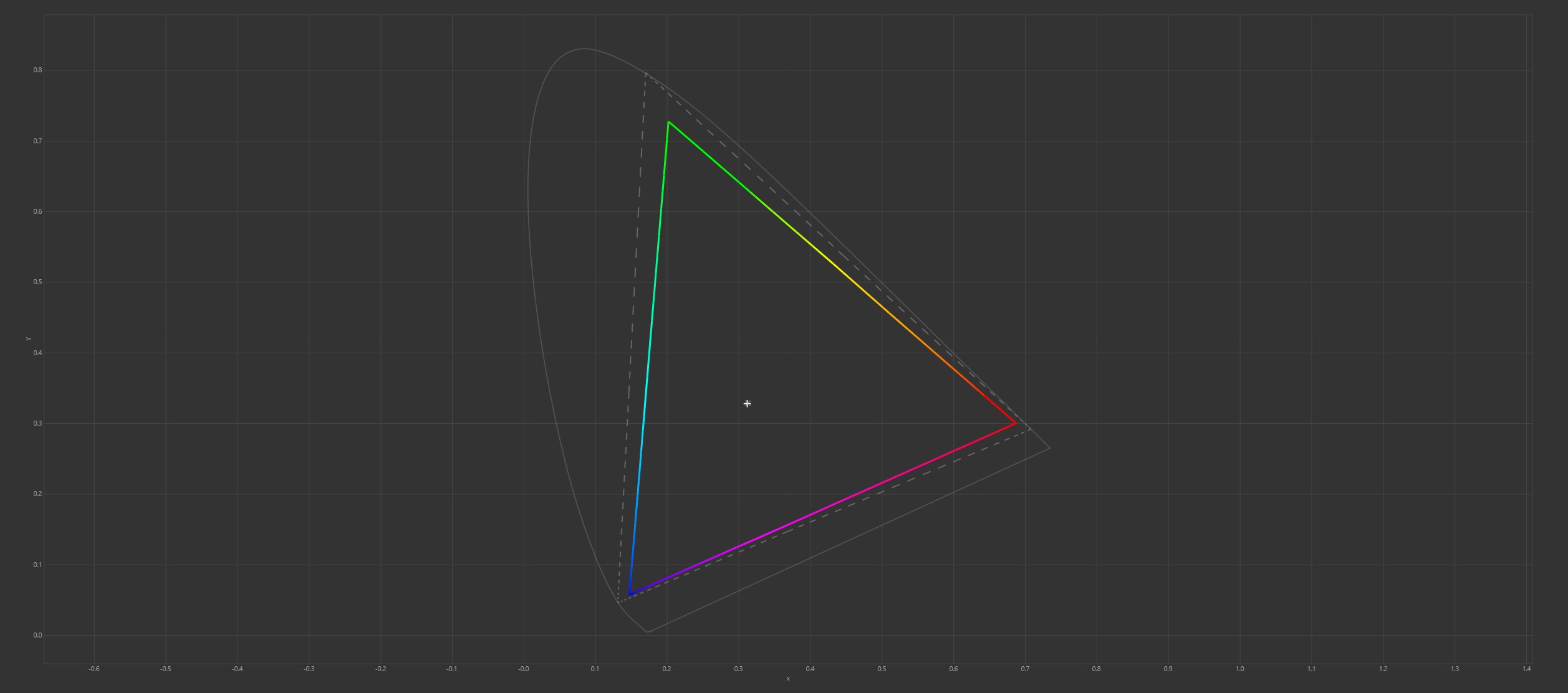
And there is the nice dashed triangle representing the color space ITU-R Recommendation BT. 2020 defined. The ASUS ROG Swift PG279QM is one of the best consumer monitors and manages a rec. 2020 coverage of 82% and thus meets the minimum requirement for HDR (>70% Rec. 2020). The color space Rec. 2020 was introduced in August 2013 and is gaining more and more importance. This color space covers Adobe RGB, P3, CMYK and sRGB/Rec. 709 ab. One for all quais. Until now, there have been few to no displays that could achieve any notable coverage here. With very good IPS panels, it now goes up to the 85% mark and QD-OLED comes in the best case to the >90% color space coverage rec. 2020 approaching. So it’s in the right direction – namely forward.
Which gamma curve is needed for Rec. 2020? Gamma 2.4 or BT.1886 (basically lies between Gamma 2.2 and 2.4). I use C1 BT.1886 at home with my LG OLED, I personally like it better than Gamma 2.4 (matter of taste).
Image editing with Adobe Photoshop
What do you think the Adobe RGB color space is derived from? Difficult question! Wasn’t there something in 1998 and the software manufacturer Adobe? Yes, that rings a bell. They created the color space, so to speak, to bring the CMYK color space (for color printers) together with that of monitors. Compared to sRGB, the gamut reaches especially into the green tones.
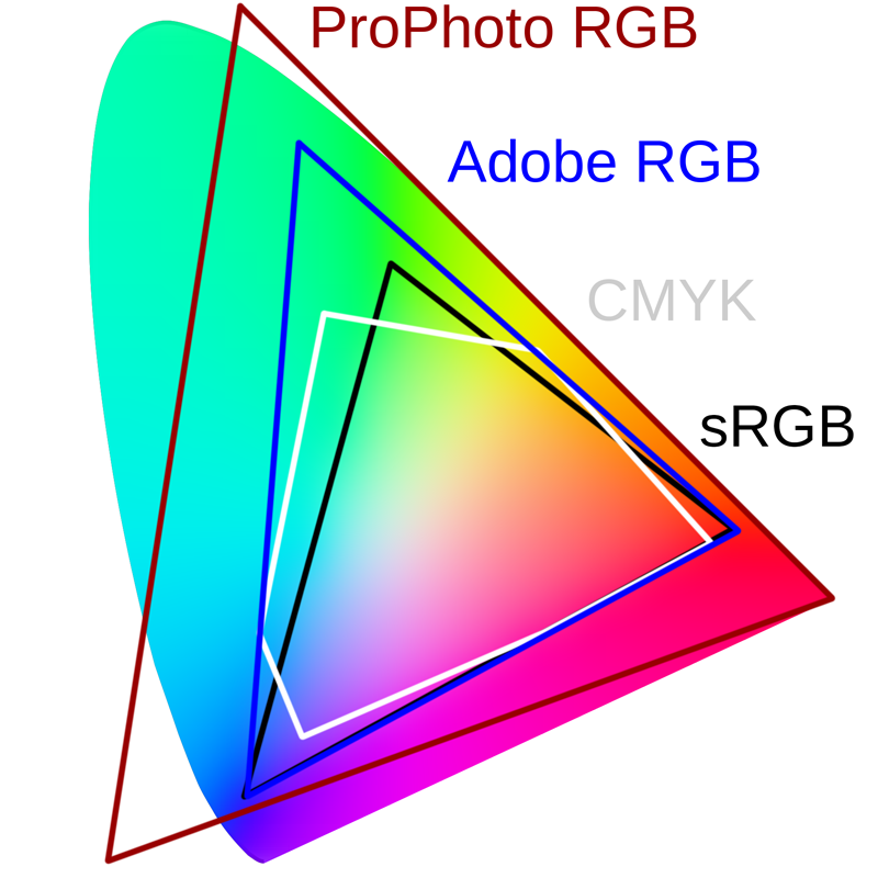 Image source Here
Even more color spaces? Yes, sorry there is much more. We’ll stop right here, too, because otherwise it will drift too much into the boundless. For a better understanding: You see why Adobe created the Adobe RGB (Gamma 2.2) color space? CMYK is clearly more in the green-blue range than sRGB, so Adobe RGB simply fits better into the overall picture. Photo professionals have already spied the ProPhoto RGB color space. This color space goes far beyond what is humanly visible. In contrast, Rec. 2020 just a larger front yard. This is the color space where most of the color information is located, which in the end also means: You need huge amounts of memory!

The PG279QM can cover Adobe RGB at 100% (uncalibrated) and is best suited for professional work. For me personally, one of the best gaming work monitors ever. Unfortunately, this also has its price, but life is not a pony farm – even the ponies think that’s stupid.
So my dear readers, in conclusion I would like to point out something important. Monitor manufacturers sometimes give strange values in terms of color space coverage. So you often read something like this: sRGB 135% or Adobe RGB 120%. Such values look really great at first, but have nothing to do with the actual color space coverage (shape and position). If you refer to a specific color space, it is located at a determinate position in a defined shape in the CIE diagram. This form and location can be met or not up to 100%.
 ASUS ROG Swift PG279QM after calibration to D65, 200 nits with gamma 2.2
These fabulous values (e.g. 165.5% sRGB) refer to the color space volume (without shape and position). Any monitor that has, say, 98% Adobe RGB or 97% DCI-P3 color space coverage will inevitably have a much higher color space volume relative to sRGB. That’s why these expanded color spaces exist, otherwise we’d have to watch UHD HDR with the tiny color space volume of Rec.709 and that would be pretty pathetic.
Nevertheless, watch out what values the monitor manufacturers specify here!
How do I measure the color space coverage?
First, I let the monitor warm up for at least 30 minutes, then I use SpyderX Elite (with SpyderX software) to measure the color space coverage in the manufacturer’s default configuration. And that looks like this:
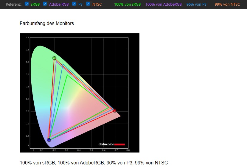 NTSC is an American standard color space for analog television. That only affects us peripherally!
Secondly, I calibrate each monitor to the D65 at 200 nits with a gamma of 2.2 using DisplayCal and at the end DisplayCal shows the values regarding color space coverage or color space volume. With DisplayCal, this only works in conjunction with a calibration, which I find quite a shame. You already know the picture:
Finally, to return to the initial question: How much color space does the user need? Quite simply, 100% sRGB coverage is basically enough for gamers. Likewise, the 100% sRGB is enough for everyone who browses the Internet and uses standard apps under Windows. If you want more color saturation/volume/space – you should look for P3 and/or Adobe RGB monitors. Those who need it professionally will already know what they need. In the end, everything has its price. Ok, then we go further in the text – turn the page!


26 Antworten
Kommentar
Lade neue Kommentare
Urgestein
Veteran
Urgestein
Moderator
Moderator
Urgestein
Urgestein
Moderator
Veteran
Moderator
Veteran
Veteran
Urgestein
Veteran
Mitglied
Mitglied
Veteran
Veteran
Veteran
Alle Kommentare lesen unter igor´sLAB Community →