


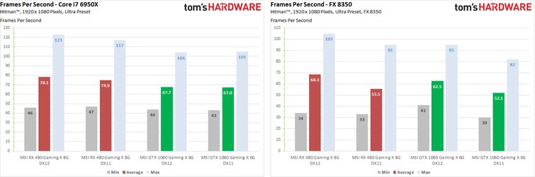
Frames per second
In the end, these time-based averages only tell how many single frames have been rendered within a second. But you just don't realize how "round" and balanced the image flow really was in this quite large period of time.
Because a second with a slow 100ms frame and much faster frames can be perceived purely subjectively as significantly worse (because more jerky) than a second with slightly slower but constant rendering times of the frames – then 60 FPS work may even be significantly worse than perhaps 50 FPS.
Nevertheless, let's take a quick look at the bar charts for the faster and slower system. In addition, the rough indicators for scrolling in the form of the maximum and minimum FPS are often simply omitted, which are anyway for the ton in a longer benchmark run with strongly changing content and are only effective for comparing several graphics cards – at least to some extent. To enlarge, please click on these and the following double graphics:
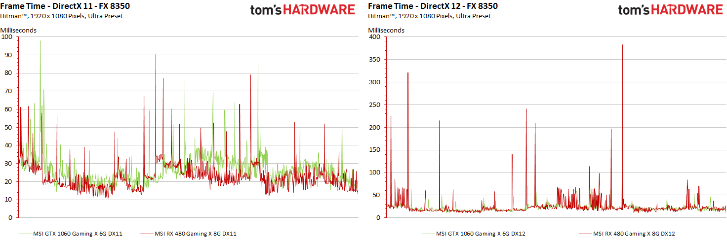
Behind these rather definitive bars, however, hide much more interesting curves, which reflect the so-called FPS course over the measured time. This is still not really accurate, but for comparison it is always more interesting than static bars. Let's compare the two cards in the DirectX-11 and DirectX-12 render paths, separated for the two test systems:
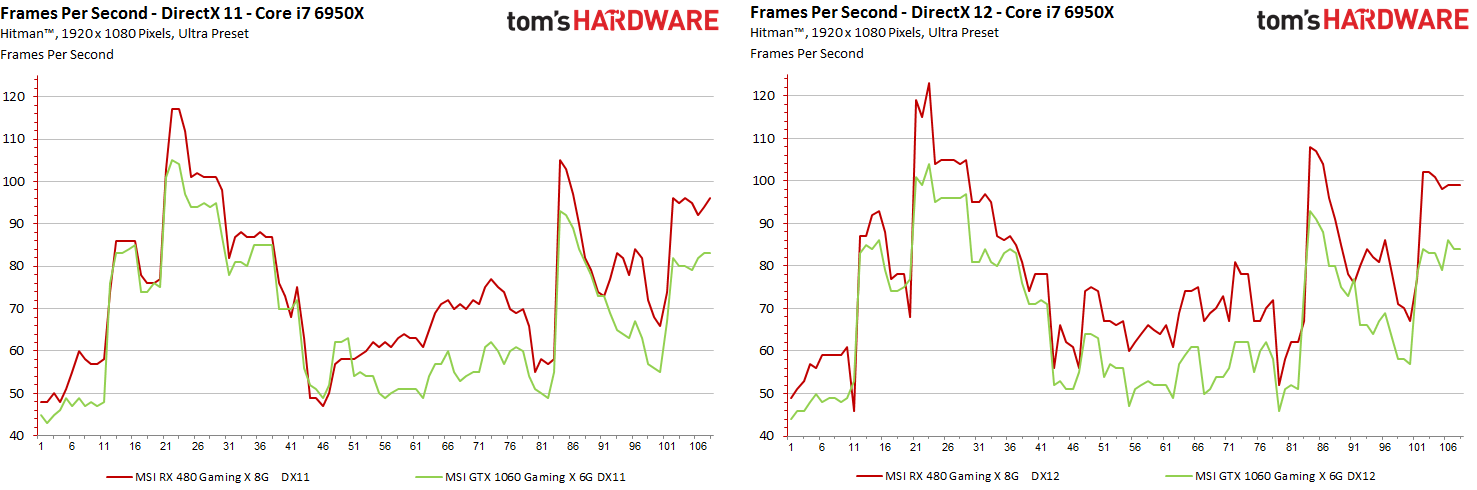
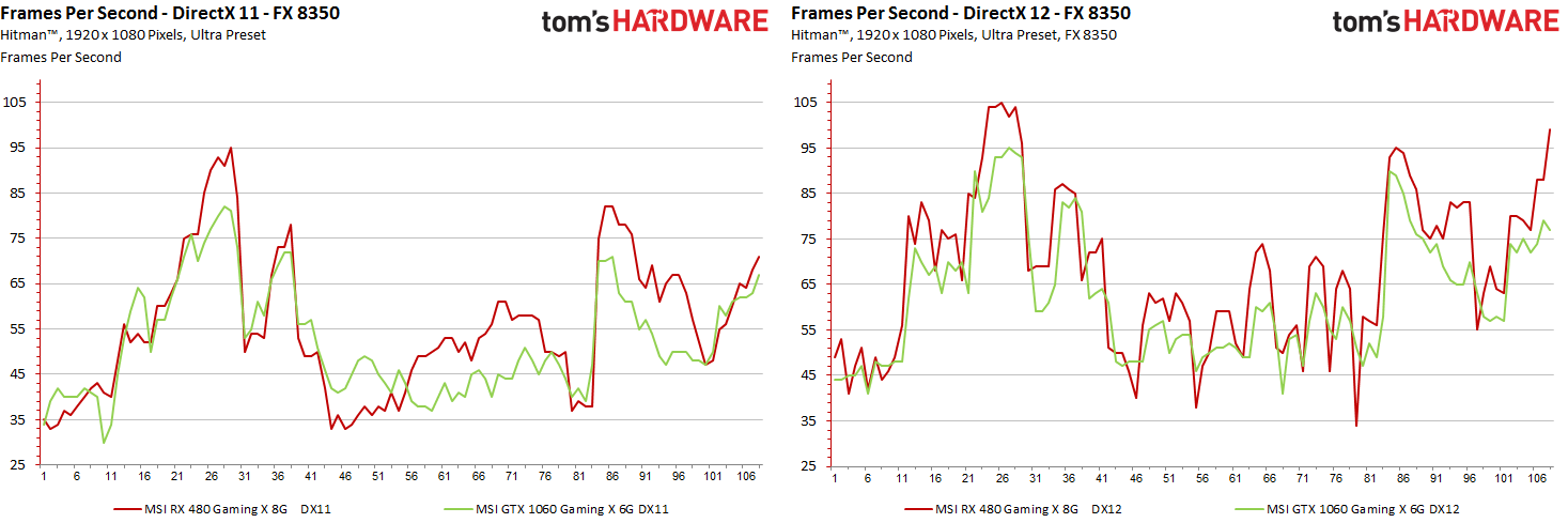
For the maximum 108 seconds of the test run, we have 108 entries on the X axis with the respective actual FPS values for each of the seconds. But even now we don't know anything about possible frame drops or microjerkers, because they are still very rough averages so far.
This is precisely why the rendering times and their correct presentation or Interpretation is so important, because a pure FPS indication – be it bars or curves – simply does not say anything about the real sense of play.
Frame Times and rendered frames
The display of the individual rendering times of all output single frames as a gradient curve looks simple at first, but it is no longer possible at the latest if you use cards of varying speeds, which are used in a certain, fixed time (the 108 seconds ) each render a very different number of individual frames.
For example, the MSI Radeon RX 480 Gaming X 8G creates 8090 frames in the DX11 benchmark on the fast system, and 8446 frames under DirectX 12 in the same time span. The MSI GeForce GTX 1060 Gaming X 6G is available with 7362 and 7332 frames slightly back.
It is very important for the understanding of the graphical "flow" and the explanation for a certain subjective feeling to compare the rendering times of the individual frames directly with each other. Only: Unfortunately, you can no longer easily superimpose these different lengths of data sets on a common horizontal axis as with the FPS curves, all based on 108 individual values for the respective second.
For the two test systems – starting with the faster test setup – this looks like this:
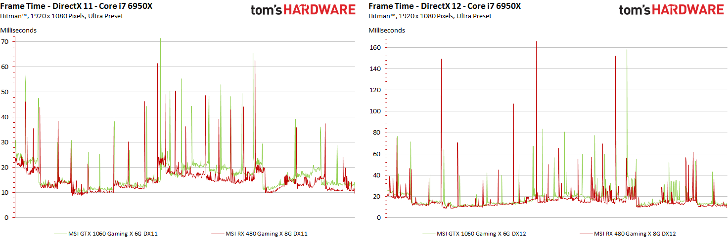
On both graphs it must also be noted that the respective Y axes of the included diagrams have been scaled to the respective values of the diagram with the render times and that the diagrams are directly related in terms of content but not visually. . In practice, one will always strive to show as many details as possible and to adjust the actual cutout on the Y-axis to the occurring minima and maxima. Therefore, the axis label must always be taken into account.
Now we have already got a first impression of what the frame gradient looks like when you bring all curves to a common length. But Excel can't do that, so we let our software do this, delivering optimized curves of the same length for all maps. But how do you get the 8446 or 7362 individual values to the common length of e.g. 1000 values we can insert into Excel?
Similar to optical scaling (resampling), we try to preserve the dominant image content as losslessly as possible for evaluation. With superimposed values, the larger values cover the smaller ones, so that our "swork" of the data series corresponds exactly to the optical variant and e.g. all spikes are received in full. The rest is neatly interpolated. We use these data series exclusively for optical output – you can't expect that. However, we need to do this all the more for the next tasks.


Kommentieren